Learning Objectives
How do I know if I like a color?Look in your closet. What color are your clothes?
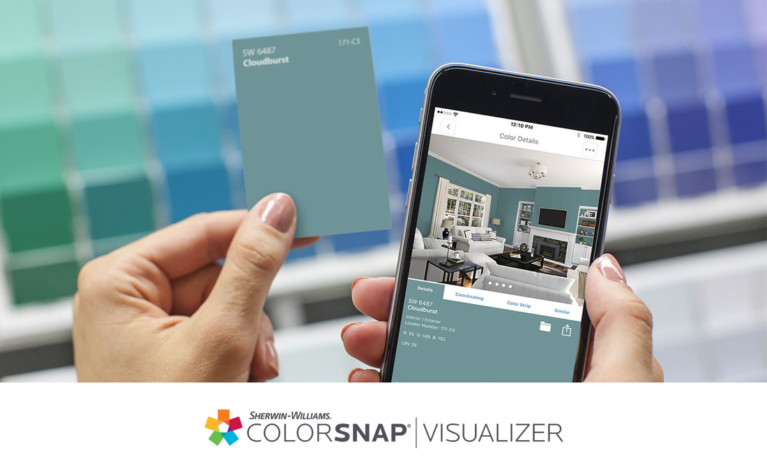
Are there clothes you never want to wear? Many of us are overwhelmed when trying to decide what color to use in our homes. That's OK, this is not unusual. Decisions are difficult, deciding what color to paint your front door can leave you feeling unsure. There are tools and tricks for you to use, consider some of these. Test drive a colorHow can I predict how colors will look? There are many different paint color apps. Some let you photograph your wall or door and digitally try out a new color, or try it on a sample room, and some apps match colors.
How can I know if colors will look good together?Analogous
When choosing color, consider ones that are near each other on the color wheel, this is called Analogous. Warm or Cool Look for colors that are either warm or cool A warm grey will have more reddish tones, the cool grey will look bluer. To check this, put both samples on a white piece of paper. you will see some are warmer and some are cooler. Accent Colors Colors that are opposite on the color wheel are called Complimentary. This is not the same as someone 'giving you a compliment' saying your hair looks nice today. in the world of color, complimentary means directly opposite on the color wheel; Yellow & Purple, Turquoise & Orange, Green & Red are a few examples. You want to consider proportion when combining complimentary colors. Adding an accent of a pillow or work of art in the opposite color may be just the right amount of life a room needs, or it can be unsettling. A little goes a long way. Consider a variation in the intensity of the complimentary colors. For example, if your room is yellow, then maybe a violet or light pale purple would be more calming than a bright saturated purple against a bright yellow bedspread. You can even create a visual phenomena called 'vibrating boundaries' where the colors seem to be moving where they meet, when using bright fully saturated colors. See Color Phenomena for more. Tinting a color with white softens all colors. This will both brighten the room and dim the intensity of the color. Shade is the term used to darken a color, as in what happens when the sunlight is blocked by an umbrella. The color shifts to a darker tone. Value is the term used to describe the range of dark to light, often shown as 'grey scale' used for comparison. Creating a Grey Scale is surprisingly difficult, students are asked to make a row of light to dark in 10 steps. This design school classic not only helps us learn to mix colors and greys in smooth progression, t also trains our eyes to the subtleties of shade, tint, and value. Saturation is the term used to describe the intensity of the color. The most 'saturated' colors are the ones we learn to recognize in Kindergarten: Yellow, Green, Blue, Purple, Red, Orange. Is it Yellow Orange or Orange Yellow? The name that goes last is the dominant color. If appears more like a lemon, it is Orange Yellow, conversely; if it appears more like a tangerine, it is Yellow Orange. This is subjective, meaning it is up to an individual to decide. Everyone sees color a little differently. For review from some of the other pages, Color in Paint: Combine all colors in paint and you get black : Combine all colors in light and you get white. The Primary Colors in paint are: Yellow, Blue, Red The Secondary Colors in paint are: Green, Orange, Purple Colors that are opposite on the color wheel are called 'Complimentary.' The appearance of pigments, paints, and dyes is dependant on the lighting, after all this is a lighting education website! In retail stores, it is not uncommon for customers to take merchandise to a window, "To see how it looks in natural light." You can't beat Mother Nature. And it is hard to replicate the sun. Visit the Light section to learn more about color bias of various light sources and how you can achieve the best possible color rendering within your budget, code, and energy constraints. Be clear on your assumptions and expectations. |
Gloria Jaroff's wisdom on color in your home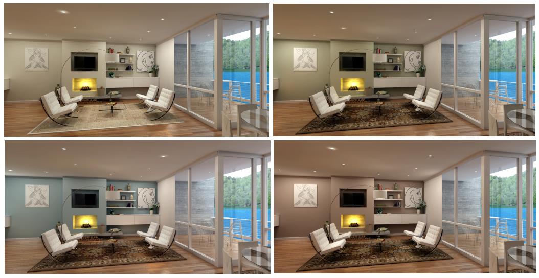
To read the article https://commonedge.org/the-boundless-banality-of-beige-a-rant/
Gloria Jaroff is a retired registered architect and Emeritus member of the AIA. She studied at the New York School of Interior Design and Columbia University before graduating architecture school from City College of New York. Her book, The Nature of Color in Interior Design, emphasizes the importance of texture and movement created by light and shadow in the natural environment. Enjoy Gloria's book "The Nature of Color in Interior Design" https://www.amazon.com/Nature-Color-Interior-Design/dp/1515377008 Design professionals make a color boardA color board gives you a chance to see the colors next to each other, either on your computer screen, a piece of paper, or on a large board with actual samples of textiles, carpet, tiles, wood, granite, brick, and paint. A well executed color board allows for everyone to see all the materials in one place and discuss alternatives. Many Architectural Board of Review committees require color boards.
Gloss, Eggshell, Flat?The amount of shine in your paint will affect how the color looks, shiny paint reflects more light. it also shows more flaws in the wall surface.
Paint chips are flat or matt finish. When you paint your wall, it will dry and look one or two steps different than the paint chip due to the larger surface area and the amount of light in the room. Try painting a large swatch on the wall if you are unsure. When wet, paint may look darker then when it is dry. Paint companies differ in the finishes they offer, less expensive paint has fewer finish options. Super-Matte
Paint Chips, Fan Decks, & SamplesThere is an old joke among painters about how a customer wanted a rose color, except when it was finished, the color was not what was expected. The rose had wilted and faded to brown by the time the paint was matched.
When in doubt, ask for a sample. Today, we can buy a tiny can of paint for a few dollars, this allows you to test it on the wall, or if you prefer, on a piece of paper taped to the wall. Some companies offer large size stickers. We used to order 'draw downs' that were 8x10 painted cards of colors being considered. Whatever method you choose, be sure to check it under different times of day and different lighting conditions. With today's LED's and their inherient color bias, you may be surprised that the color has shifted or is duller, more grey, or brighter than expected. See LED Color Rendering Paint EducationWe humans can see over 7 million colors!
Sherwin Williams has a series of paint and application educational programs available for free on their CEU (Continuing Education Units) website. https://www.swceulearn.com/library/ Footnotes
Photo Credits
|
- Home
-
- CHROMA Topics
- Color Spectrum - Light is Energy
- Color in Light
- Color in Nature
- Color in Paint
- Why does paint fade?
- Color Names & Meanings
- Color Phenomena
- Color Perception is Individual
- Color In Fashion
- Color for your home
- Color in Space
- Color Blindness
- Color Blind Interview
- Synesthesia
- Synesthete Deborah Borrowdale-Cox
- Synesthete Stephen Orr, BH&G Editor
-
- Circadian & THERAPY Topics
- Circadian Explained
- Circadian Ganglion Cells
- Circadian Melatonin
- Circadian Animals
- Circadian Research
- Autism & Lighting for the Spectrum
- Blue Light Dimming Apps
- Red Night Lights
- Vitamin D & Light
- SAD - Seasonal Affective Disorder
- Alzheimers and Light Therapy
- Photosensitivity - Light Sensitive Drugs
- Red Light Therapy
- Sleep & Lighting
- Dreams and Second Sleep
- NASA - Lighting in Space & Undersea
- Jet Lag
- Sunglasses
- Chakras
- Crystals, Minerals, & Gemstones
-
- LIGHTing Design Topics
- UV Germicidal Disinfection Light
- LED Lighting Facts Card
- CRI - Color Rendering Index
- LED TM-30
- LED Kelvin Color
- LED LPW
- LED Flicker
- LED Glare
- OLED - Organic LED
- Human Centric Lighting
- Lighting with Daylighting
- Lighting for Healthy Buildings & Zero Net Energy
- Lighting for Healthcare
- Lighting for Horticulture
- Lighting for Hospitality & LED Retrofits
- Lighting for Museums
- Lighting for Seniors & Low Vision
- Lighting Design Tips & Codes
- Parking Lot Lighting
- Solar Lighting for Humanity & World Health
- Davis Insectary Garden
- Santa Barbara Mesa Insectary Garden